Session Details
Room: Supper
Format: Presentation & Discussion
No. of attendees: 16
Host name: Armando Mazzei (SGS Economics & Planning)
Scribe: Matthew Diemer
What's it about?
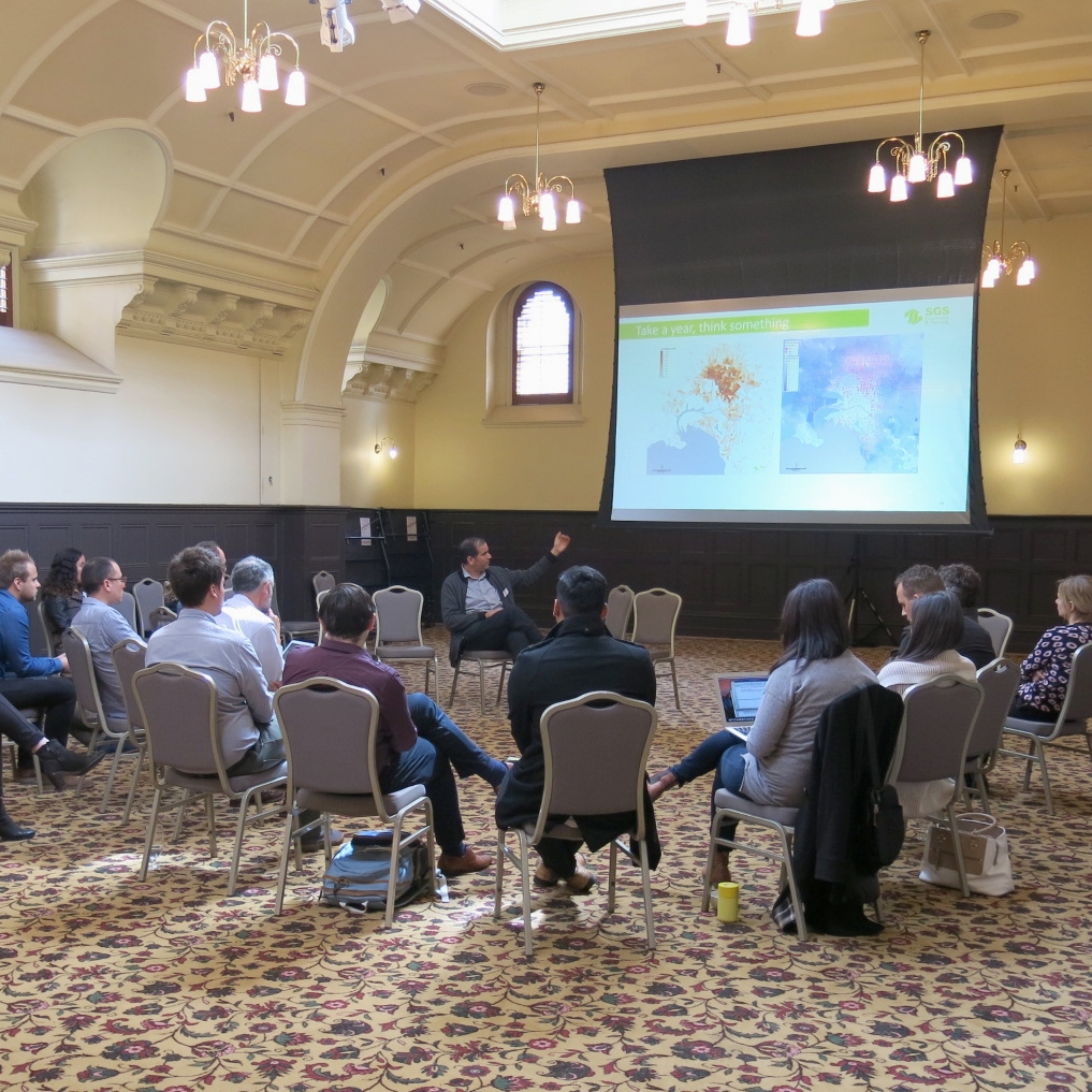
Inspired by Ride to Work day to better visualise data of cycling usage:
Where are people coming from when they ride to work?
How do the different neighbourhoods compare to each other?
Data shows that after 6km distance to work, riding numbers begin to fall
High Quality Infrastructure is key to increasing ridership
What’s changed?
Evolution from Industrial Economy to Knowledge Economy means clustering of businesses, people are more important than it has been historically
Driving a car in a clustered economy is more difficult because land uses are less spread out and distances between destinations are shorter, making walking and cycling more efficient options
The private automobile as a method of travel to work in the City of Melbourne has showed a decrease of 10% over the past 10 years
Melbourne’s far reaching train and tram systems make PT a more viable option compared to other Australian cities. But PT is overcrowded, making cycling a more convenient option for people in the CBD and inner suburbs.
Displayed maps that showed how cycling access expands the amount of jobs you can reach within 45 minutes even more than the PT network alone and in some cases cycling allows you to access more jobs in 45 minutes than PT
The economy is shaping our cities and therefore our transport choices
Some rationale can be utilised to identify the areas where riding is likely to happen based on economic development (i.e. urban renewal projects such as Fishermans Bend will likely create opportunities for significant new cycling numbers if high quality infrastructure is built)
Difficult at the moment to accurately compare cycling with PT because currently only use cycling access on street network, compared to data that might show cyclist preference to use paths that might take longer time but offer a safer environment

